LYFT
CAMPAIGNS
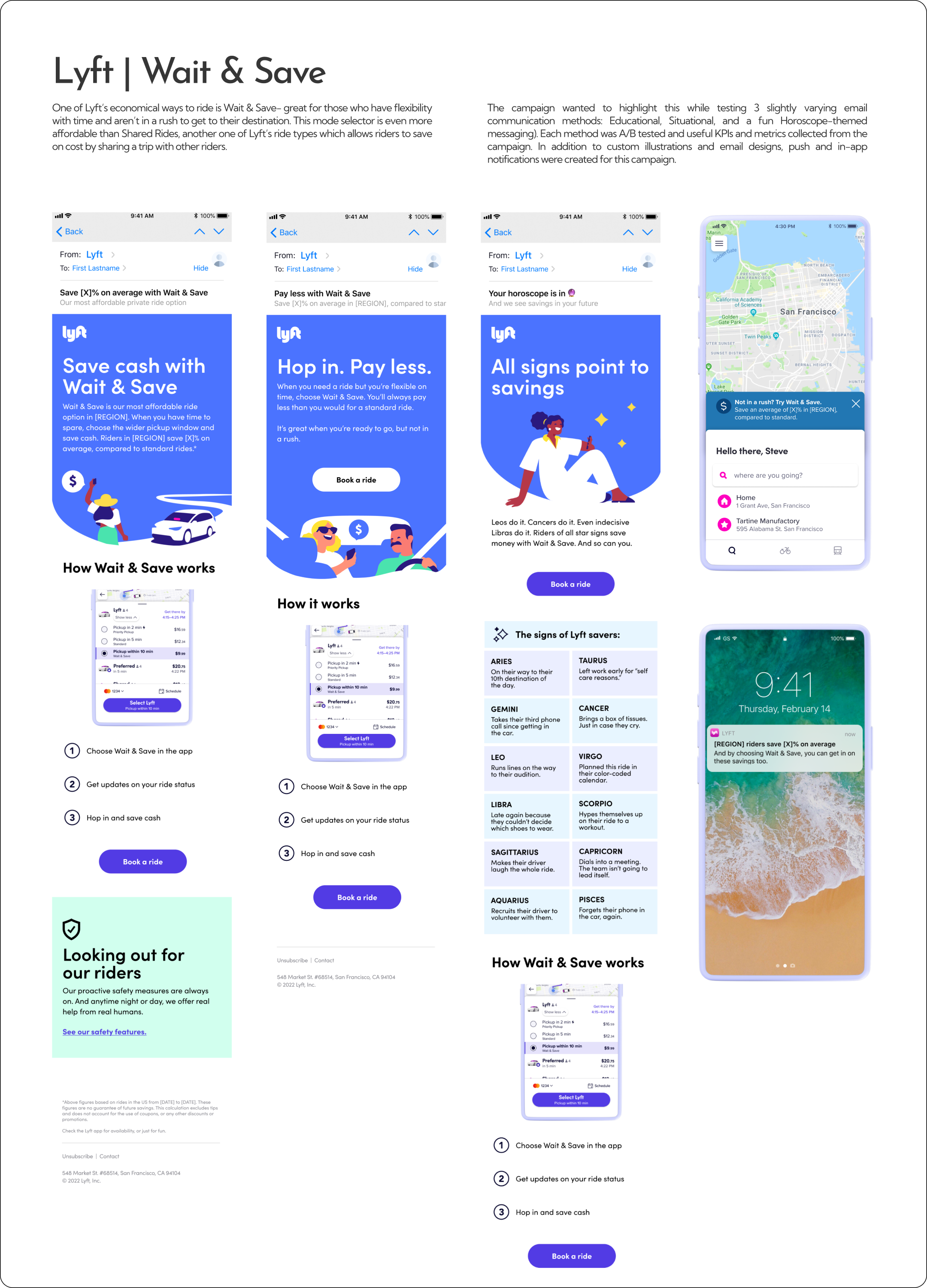
A/B testing emails created for different user groups to measure click-through rates of the CTA in the email and to educate/ promote this ride feature.
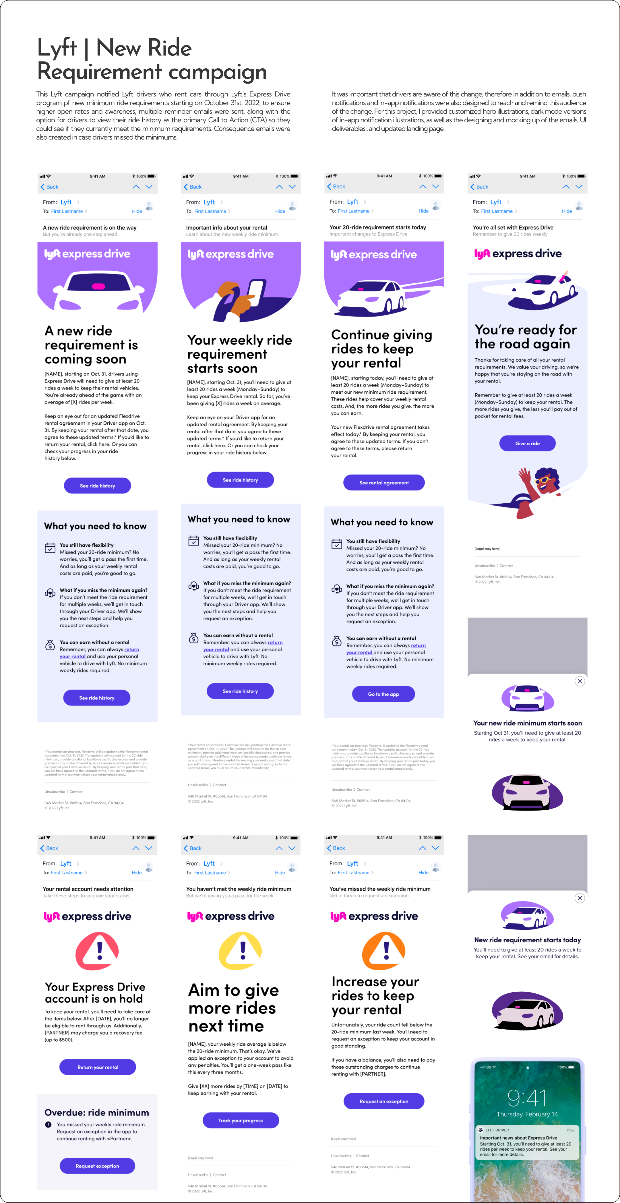
Dark mode versions of illustrations were created for the UI notifications.
Working with the product library and reporting glitches or missing components became a best practice with any project that required working with in-app and other UI components.
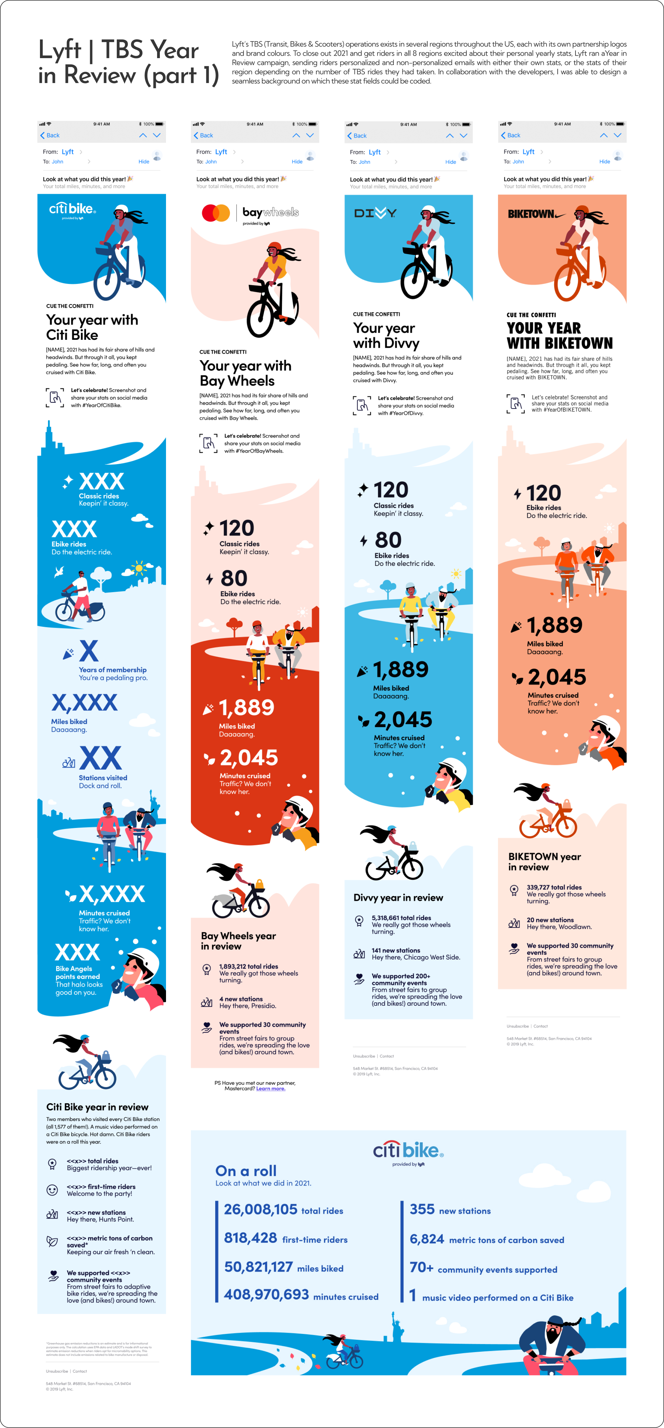
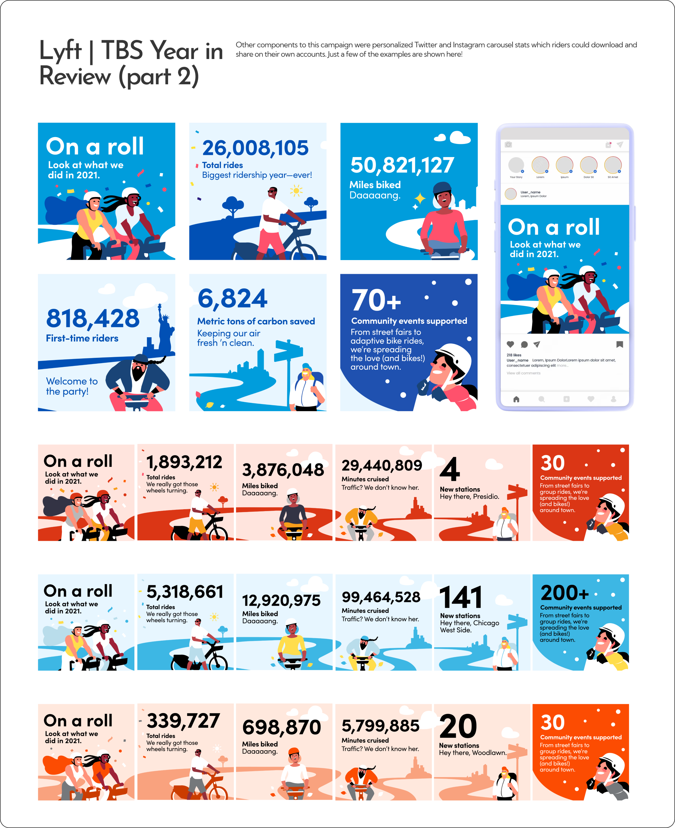
Different bike-share system partnerships with Lyft have their own brand colours and partner logos, hence the variations seen here in a few regional examples.
I worked closely with developers on this project to better learn about how I could illustrate full-length background illustrations that personalized stats would be built on.
It was important to consider the max number of digits for each personalized statistic to account for the amount of horizontal space needed, and the max text size that could be used in each section.
I used the theme and illustrations from the emails to then create social media posts for each region.
Depending on the region users lived in, email copy and illustrations changed to demonstrate Covid-19 masking requirements (i.e., no masks, all masked, some masked, or driver masked only). This applied to all the campaign’s deliverables including blog posts and app UI graphics; in this instance, masked vs non-masked character illustrations were created so the team could swap out images depending on what the changes in regulations would be at any given time.
Example of all characters masked in the car.
These social media stats, along with the personalized stat emails had such high interactions (Instagram post shares + likes) and email open + click-through rates, that the campaign was recreated with drivers in mind, along with their personalized stats.
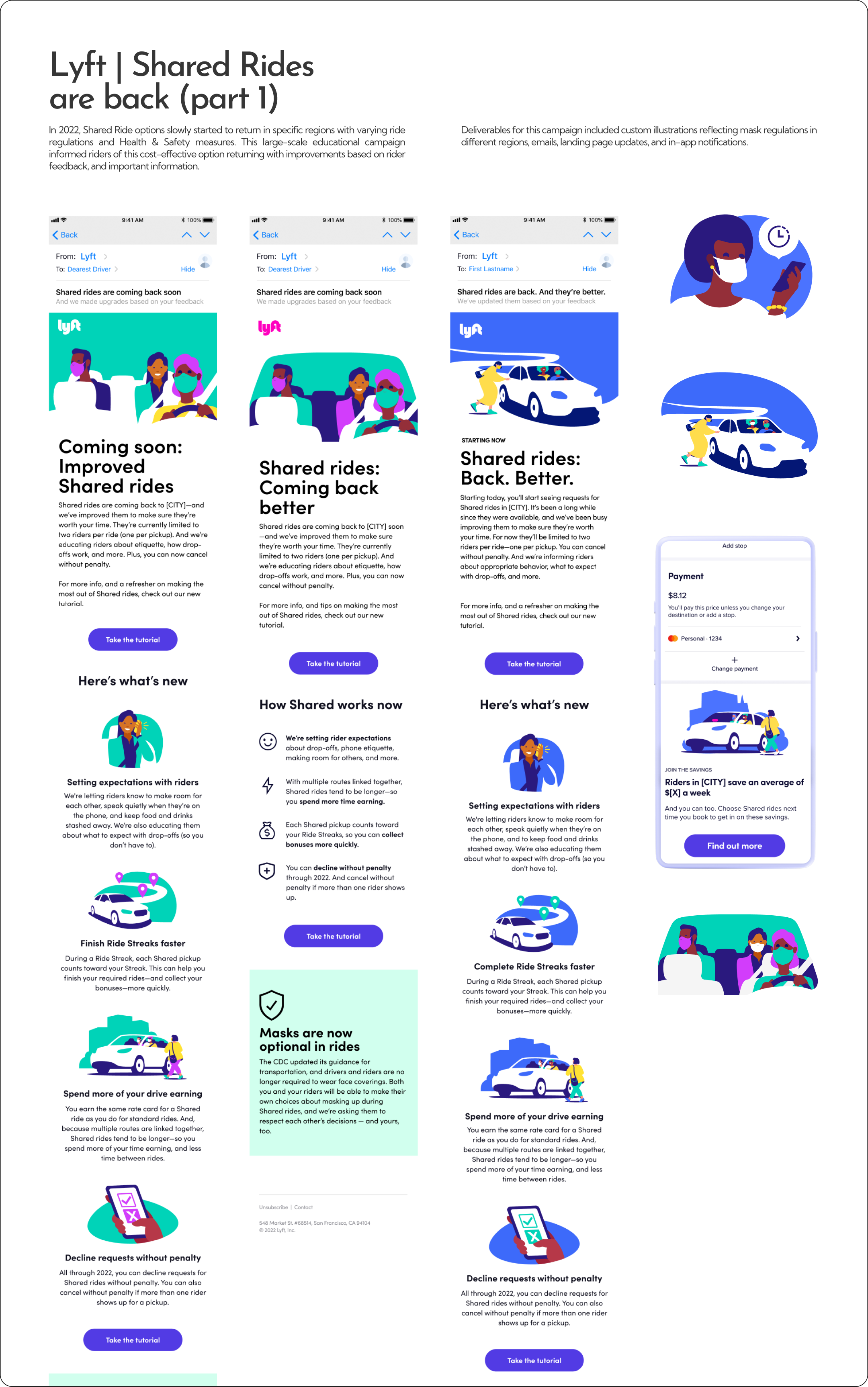
Depending on the region users lived in, email copy and illustrations changed to demonstrate Covid-19 masking requirements (i.e., no masks, all masked, some masked, or driver masked only). This applied to all the campaign’s deliverables including blog posts and app UI graphics; in this instance, masked vs non-masked character illustrations were created so the team could swap out images depending on what the changes in regulations would be at any given time.
Example of all characters masked in the car.
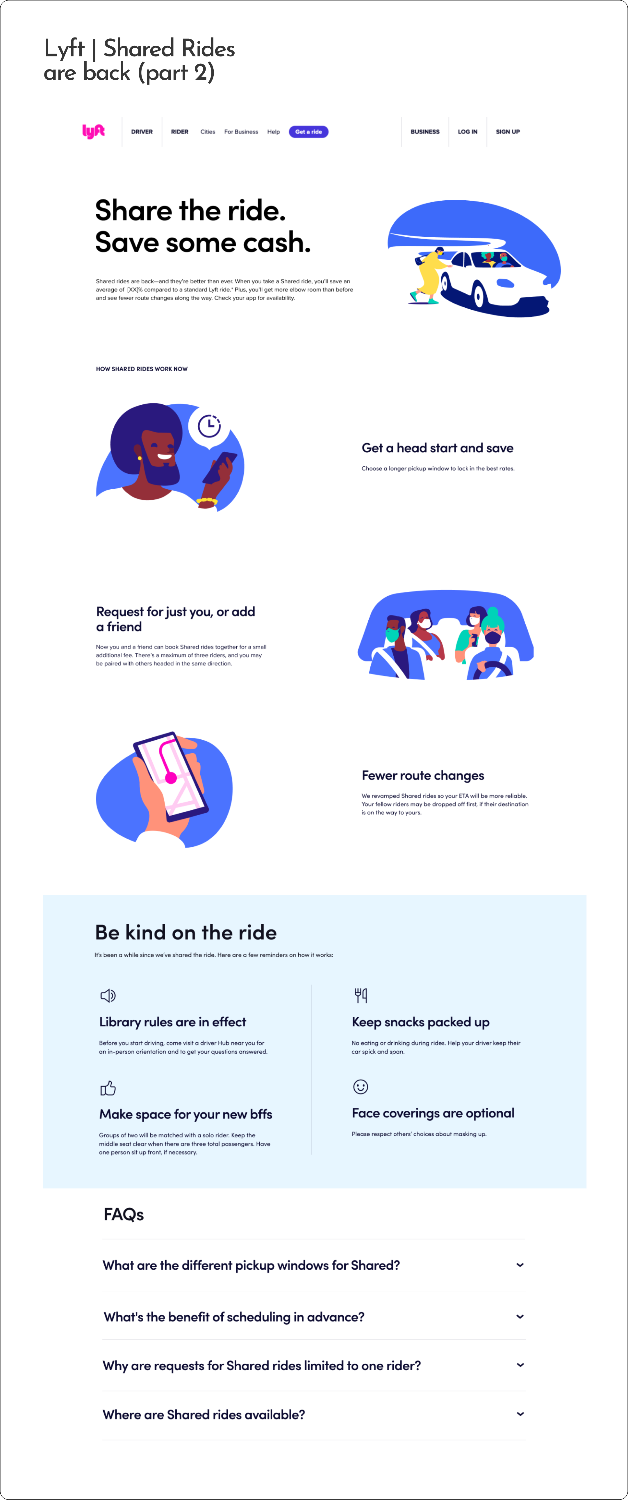
New web module created for the updated page
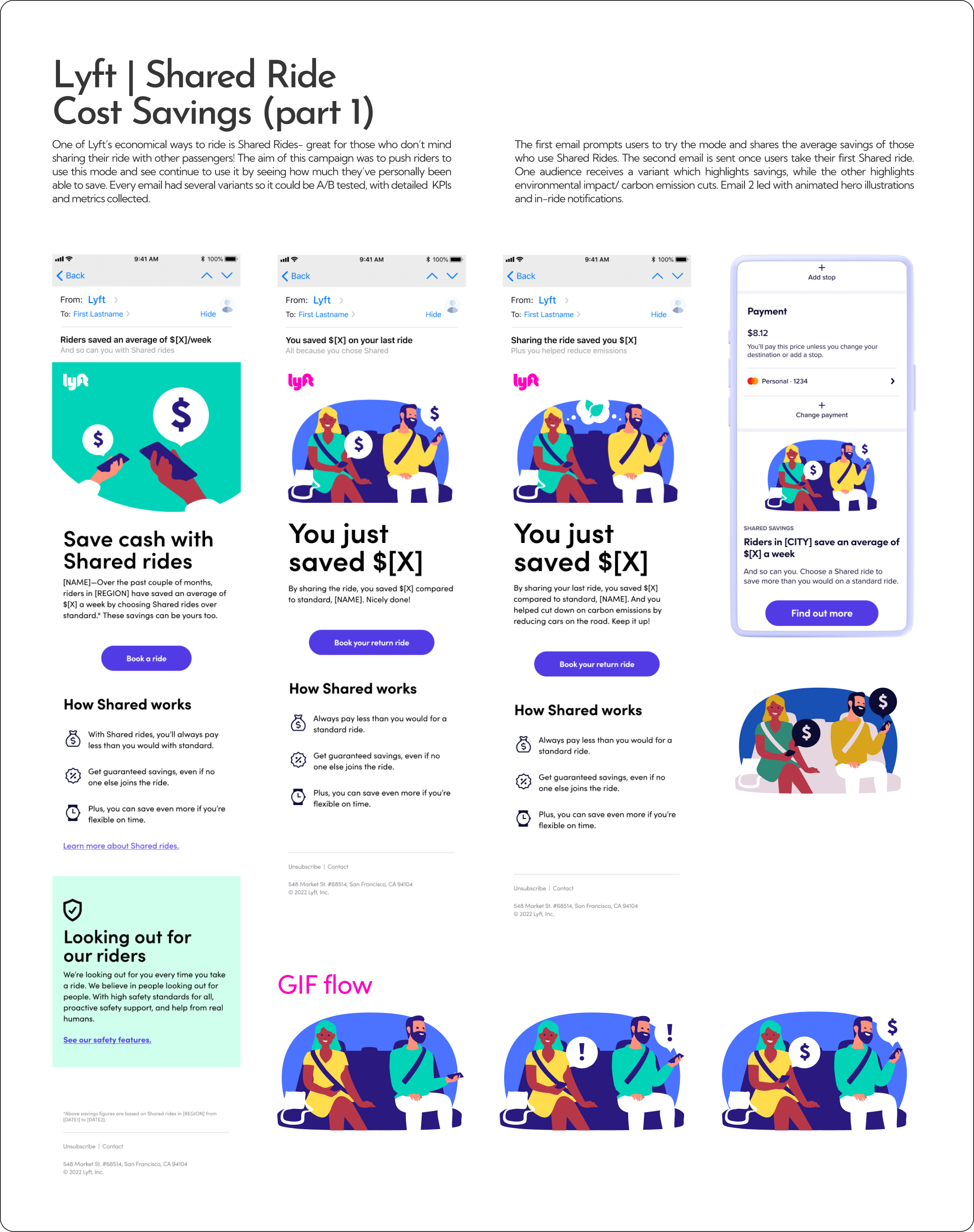
Example of an animation storyboard/ vector elements for the motion designer I worked on this campaign with.
Dark version of this hero illustration were created both for the static and animated GIF.
This campaign was A/B tested with animated vs. static hero illustrations across all emails.
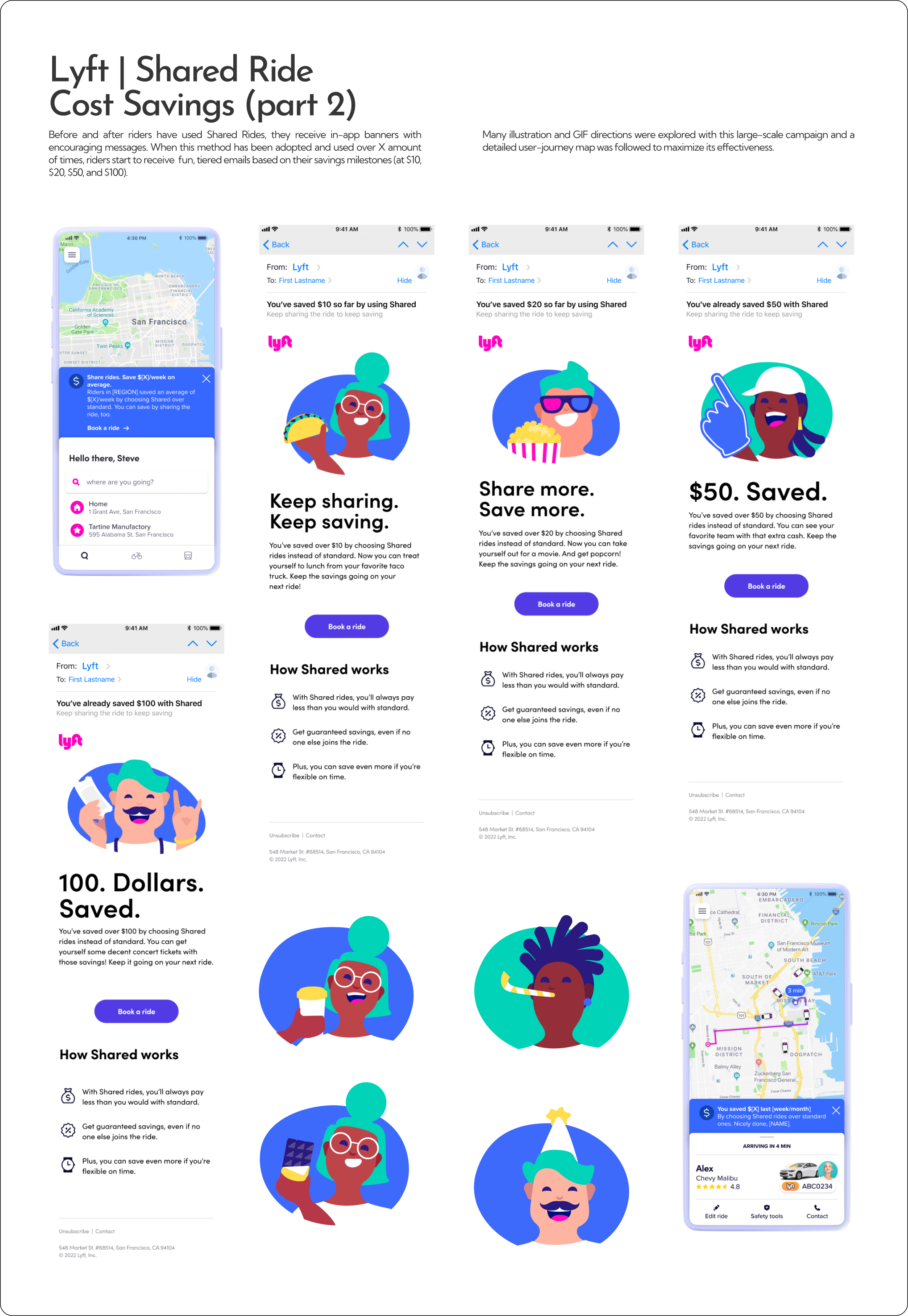
Example of a campaign that required net-new illustrations in the established brand style
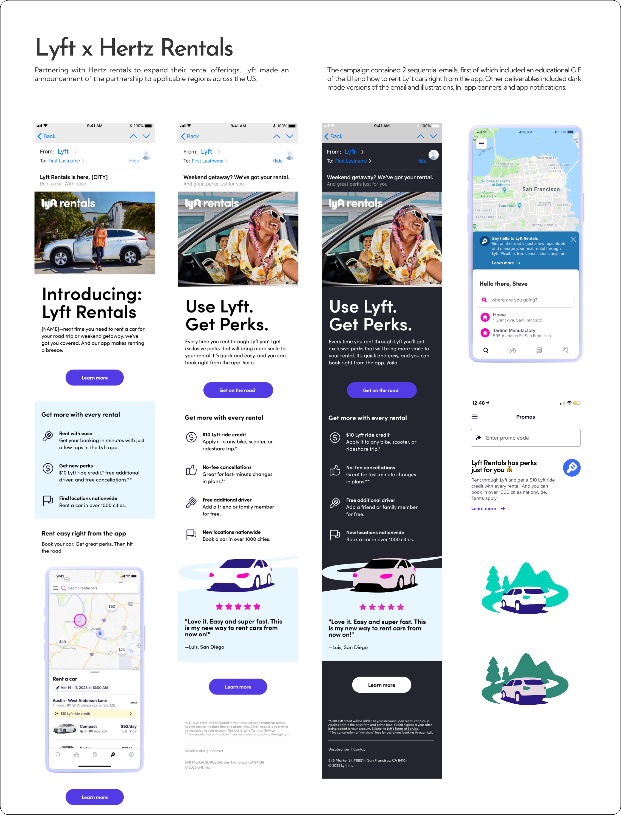
Dark versions of emails were also mocked up to provide developers as reference, following dark-mode guidelines.
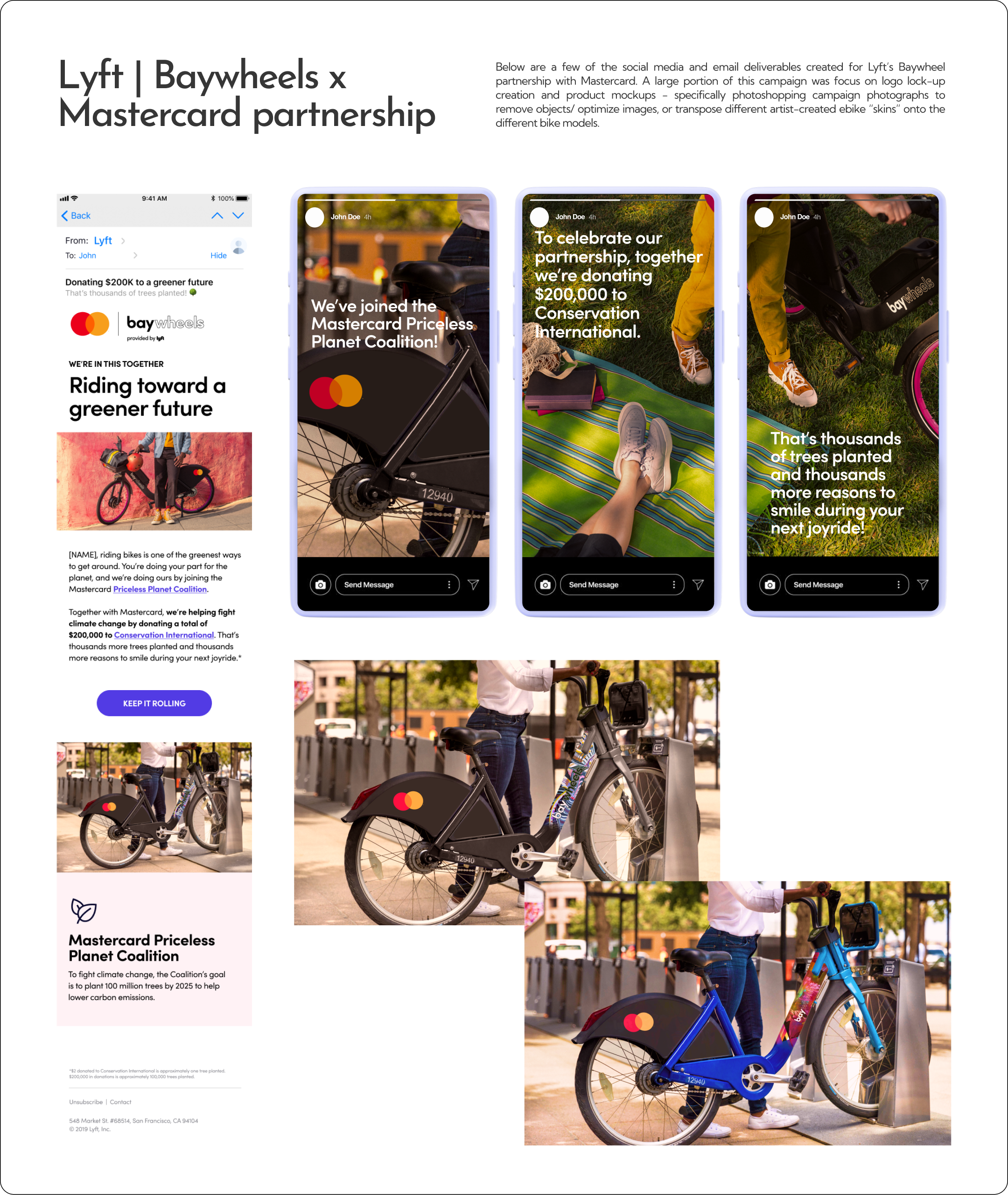
bike renders created with 2-D decal graphics prior to the product release with the intention of getting users excited along with the partnership announcement.
Sections manipulated included bike body colour, back fender decal with MasterCard logo, and the limited edition body decals.
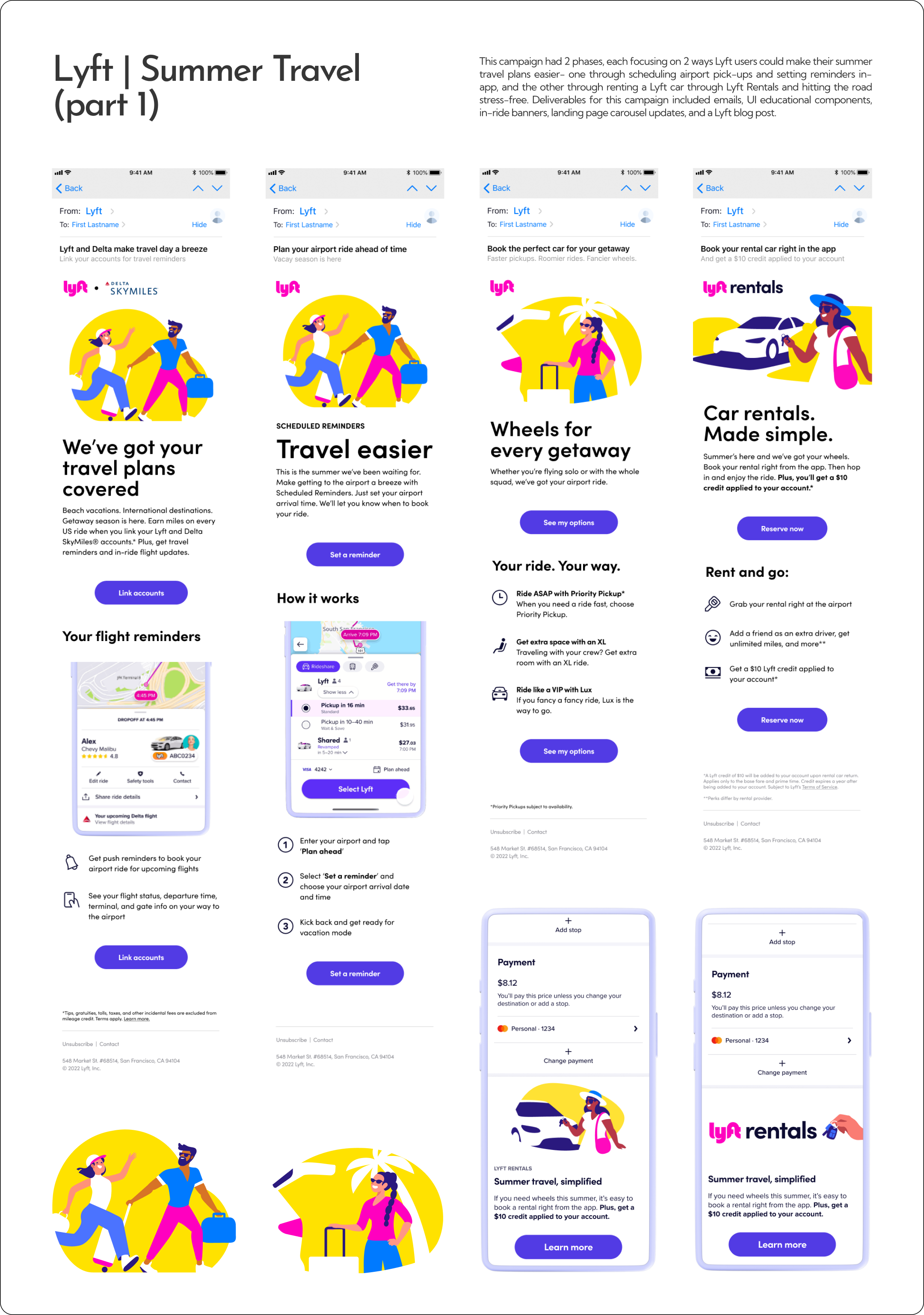
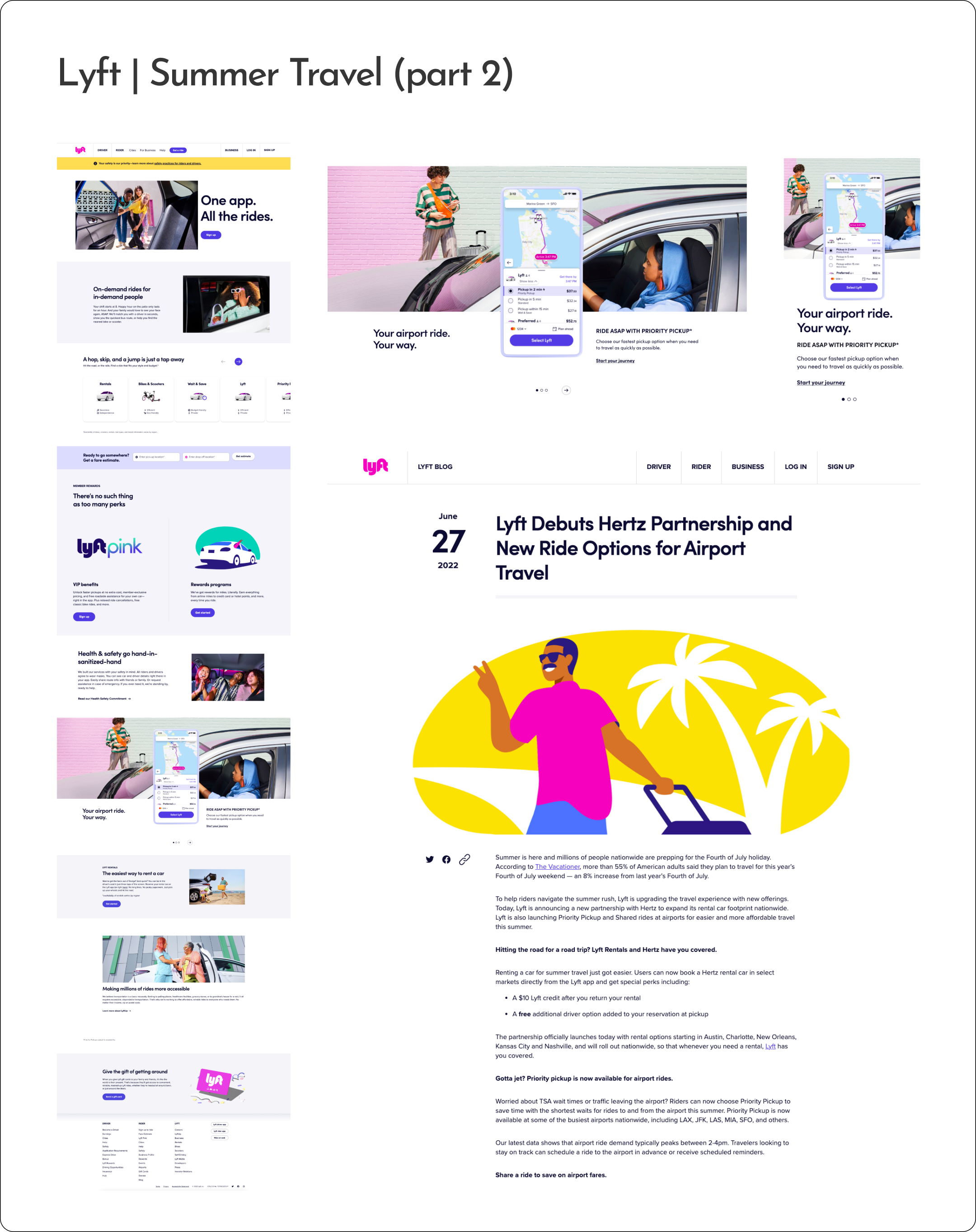
Full length of landing page with updated carousel module.
Mobile version of carousel.
Hero image of campaign resized for blog post hero image.
